TimeSwap
Project Overview
TimeSwap is a responsive web application designed to help professionals working across multiple time zones quickly visualise, compare, and coordinate meeting times. Instead of converting one time zone at a time, TimeSwap allows users to view and manipulate multiple time zones simultaneously, making it easier to find mutually suitable meeting windows.
The project was inspired by firsthand experience coordinating international sales calls and meetings across different regions, where existing tools often felt slow, fragmented, or insufficient for real-world scheduling needs.
My role: Product Designer
Scope: Problem definition, interaction design, UI design, prototyping
Platform: Responsive web
Problem
Time zone differences add avoidable complexity to scheduling meetings.
Professionals managing global teams often rely on tools that only show live times or require manual, one-off conversions.
These approaches make it difficult to:
- Compare multiple time zones at once
- Experiment with different meeting times
- Quickly understand who is within working hours
As a result, users spend unnecessary time cross-checking information, increasing friction and the risk of scheduling meetings at inconvenient or inappropriate times.
Other Tools:
Design Objective
The goal of TimeSwap was to reduce cognitive load when coordinating across time zones by:
- Allowing users to view multiple time zones simultaneously
- Making time manipulation fast and intuitive
- Clearly indicating working-hour availability at a glance
The focus was on speed, clarity, and flexibility rather than feature depth.
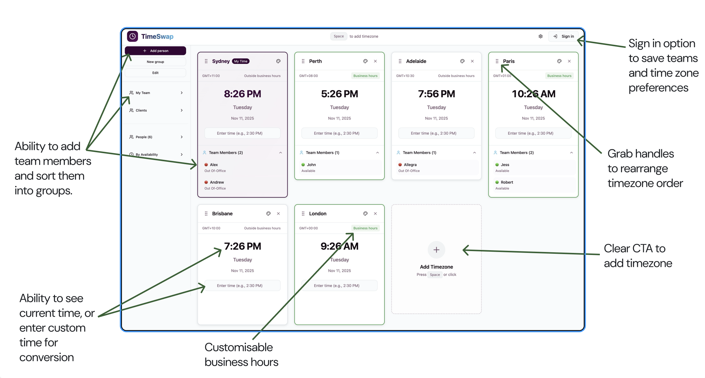
Key Design Decisions
Multi-timezone visibility
Instead of forcing users to convert one time at a time, TimeSwap displays all selected time zones side by side. Adjusting the time in any one zone instantly updates the others, enabling quick comparison and exploration of possible meeting times.
This approach supports how people actually think about scheduling, by experimenting and scanning rather than calculating.
Consolidated time cards
Early iterations separated current time displays and conversion cards into different interface elements. This created unnecessary visual clutter and required users to scan multiple areas of the screen.
The revised design consolidates everything into a single card per time zone, showing:
- Current local time
- Converted meeting time
- Working-hour status
This reduced cognitive load and made comparisons faster and more intuitive.
Working-hours awareness
To remove guesswork around availability, TimeSwap highlights whether each time zone is currently within typical working hours. This helps users avoid proposing meetings at unreasonable times without needing to cross-reference schedules manually.
Wireframes:
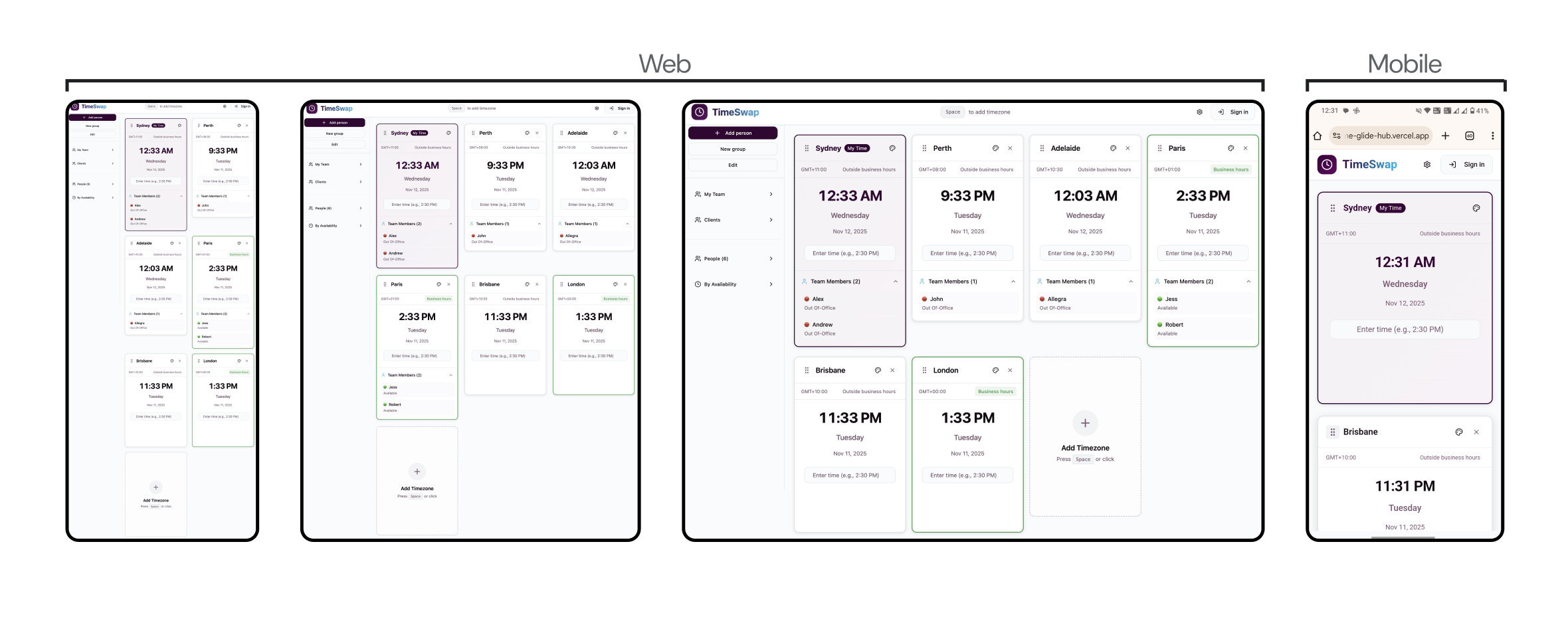
Responsive Design Approach
TimeSwap was designed with responsiveness as a core requirement rather than an afterthought.
A tile-based layout was used to create flexible, self-contained components that could:
- Rearrange cleanly across screen sizes
- Maintain hierarchy and spacing
- Scale from desktop to mobile without losing functionality
This modular structure ensured the experience remained consistent, readable, and efficient across devices.
Iteration and Refinement
A key improvement between early and later versions was simplifying the interface by reducing visual fragmentation. Combining related information into a single card per time zone made the product feel calmer and more purposeful.
Small refinements to spacing, alignment, and hierarchy further improved scanability, especially when multiple time zones were displayed at once.
Prototyping and AI Build Exploration
After defining the core interactions in Figma, I used the initial design as a reference to create a working MVP with the help of an AI-assisted build workflow. This allowed the concept to move beyond static screens and into an interactive prototype that could be tested and evaluated more realistically.
The AI-supported build process was used to:
- Translate designed flows into a functional prototype
- Rapidly experiment with interaction behaviour
- Refine functionality through quick iterations
This approach highlighted the importance of clear design intent. More precise structure and direction consistently led to outcomes that more closely matched the original design, reinforcing the role of strong product thinking even when using automated tools. The goal was not to produce production-ready code, but to better evaluate interaction decisions in a working context.
Real-World Use & Iteration
After building an interactive MVP, I shared TimeSwap with my work team, who regularly coordinate calls across multiple time zones. The product was used in real scheduling scenarios, which surfaced needs that were not fully apparent during initial design. Feedback highlighted the value of adding team members or clients to a time comparison, allowing users to see availability and overlapping working hours at a glance. I implemented this functionality based on the feedback, reinforcing the importance of validating interaction design in real working contexts and iterating based on observed use rather than assumptions.
Outcome
The final TimeSwap prototype demonstrates a clear, focused solution to a common professional problem. By prioritising multi-timezone visibility, reduced cognitive load, and responsive design, the product enables faster and more confident scheduling decisions.
Reflections
This project reinforced the value of:
- Designing for how users think, not how systems calculate
- Simplifying interfaces by consolidating related information
- Using emerging tools thoughtfully to extend a designer’s ability to prototype and test ideas
If developed further, future iterations would benefit from usability testing with distributed teams and deeper exploration of custom working-hour preferences.
TimeSwap
Project Overview
TimeSwap is a responsive web application designed to help professionals working across multiple time zones quickly visualise, compare, and coordinate meeting times. Instead of converting one time zone at a time, TimeSwap allows users to view and manipulate multiple time zones simultaneously, making it easier to find mutually suitable meeting windows.
The project was inspired by firsthand experience coordinating international sales calls and meetings across different regions, where existing tools often felt slow, fragmented, or insufficient for real-world scheduling needs.
My role: Product Designer
Scope: Problem definition, interaction design, UI design, prototyping
Platform: Responsive web
Problem
Time zone differences add avoidable complexity to scheduling meetings.
Professionals managing global teams often rely on tools that only show live times or require manual, one-off conversions.
These approaches make it difficult to:
- Compare multiple time zones at once
- Experiment with different meeting times
- Quickly understand who is within working hours
As a result, users spend unnecessary time cross-checking information, increasing friction and the risk of scheduling meetings at inconvenient or inappropriate times.
Other Tools:
Design Objective
The goal of TimeSwap was to reduce cognitive load when coordinating across time zones by:
- Allowing users to view multiple time zones simultaneously
- Making time manipulation fast and intuitive
- Clearly indicating working-hour availability at a glance
The focus was on speed, clarity, and flexibility rather than feature depth.
Key Design Decisions
Multi-timezone visibility
Instead of forcing users to convert one time at a time, TimeSwap displays all selected time zones side by side. Adjusting the time in any one zone instantly updates the others, enabling quick comparison and exploration of possible meeting times.
This approach supports how people actually think about scheduling, by experimenting and scanning rather than calculating.
Consolidated time cards
Early iterations separated current time displays and conversion cards into different interface elements. This created unnecessary visual clutter and required users to scan multiple areas of the screen.
The revised design consolidates everything into a single card per time zone, showing:
- Current local time
- Converted meeting time
- Working-hour status
This reduced cognitive load and made comparisons faster and more intuitive.
Working-hours awareness
To remove guesswork around availability, TimeSwap highlights whether each time zone is currently within typical working hours. This helps users avoid proposing meetings at unreasonable times without needing to cross-reference schedules manually.
Wireframes:
Responsive Design Approach
TimeSwap was designed with responsiveness as a core requirement rather than an afterthought.
A tile-based layout was used to create flexible, self-contained components that could:
- Rearrange cleanly across screen sizes
- Maintain hierarchy and spacing
- Scale from desktop to mobile without losing functionality
This modular structure ensured the experience remained consistent, readable, and efficient across devices.
Iteration and Refinement
A key improvement between early and later versions was simplifying the interface by reducing visual fragmentation. Combining related information into a single card per time zone made the product feel calmer and more purposeful.
Small refinements to spacing, alignment, and hierarchy further improved scanability, especially when multiple time zones were displayed at once.
Prototyping and AI Build Exploration
After defining the core interactions in Figma, I used the initial design as a reference to create a working MVP with the help of an AI-assisted build workflow. This allowed the concept to move beyond static screens and into an interactive prototype that could be tested and evaluated more realistically.
The AI-supported build process was used to:
- Translate designed flows into a functional prototype
- Rapidly experiment with interaction behaviour
- Refine functionality through quick iterations
This approach highlighted the importance of clear design intent. More precise structure and direction consistently led to outcomes that more closely matched the original design, reinforcing the role of strong product thinking even when using automated tools. The goal was not to produce production-ready code, but to better evaluate interaction decisions in a working context.
Real-World Use & Iteration
After building an interactive MVP, I shared TimeSwap with my work team, who regularly coordinate calls across multiple time zones. The product was used in real scheduling scenarios, which surfaced needs that were not fully apparent during initial design. Feedback highlighted the value of adding team members or clients to a time comparison, allowing users to see availability and overlapping working hours at a glance. I implemented this functionality based on the feedback, reinforcing the importance of validating interaction design in real working contexts and iterating based on observed use rather than assumptions.
Outcome
The final TimeSwap prototype demonstrates a clear, focused solution to a common professional problem. By prioritising multi-timezone visibility, reduced cognitive load, and responsive design, the product enables faster and more confident scheduling decisions.
Reflections
This project reinforced the value of:
- Designing for how users think, not how systems calculate
- Simplifying interfaces by consolidating related information
- Using emerging tools thoughtfully to extend a designer’s ability to prototype and test ideas
If developed further, future iterations would benefit from usability testing with distributed teams and deeper exploration of custom working-hour preferences.