Tutorly
Project Overview
Tutorly is a concept mobile app and responsive website designed to help students and parents discover, compare, and book tutors based on subject, availability, and location. At the same time, it gives tutors a central place to list their services and manage bookings.
This project was completed as part of the Google UX Design Professional Certificate, using provided research prompts and sample user data.
My role: UX Designer
Scope: Research, flows, wireframes, usability testing, high-fidelity design
Platform: Mobile app and responsive web
Problem
Students often struggle to identify and book a tutor that meets their needs.
Students and parents struggle to identify tutors who are reliable, qualified, and available at the right time or location. Many platforms require paid subscriptions, limit in-person options, or assign tutors automatically, making it hard to build continuity with someone you trust.
On the other side, independent tutors lack a centralised way to promote their services and manage availability and bookings.
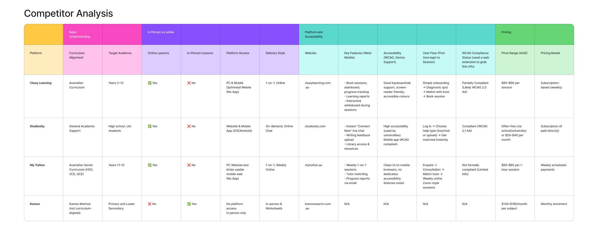
Research & Key Insights
User research for this project was based on personas. Analysing these profiles helped surface consistent needs and frustrations across different student types.
Key pain points:
- Limited access and mandatory subscriptions on existing platforms
- Lack of choice and continuity when tutors are assigned automatically
- Difficulty verifying tutor quality when booking independently
- No centralised system for tutors to manage bookings
- In-person tutoring is hard to discover and often relies on word of mouth
These insights highlighted the need for a platform that prioritises choice, clarity, and flexibility for both students and tutors.
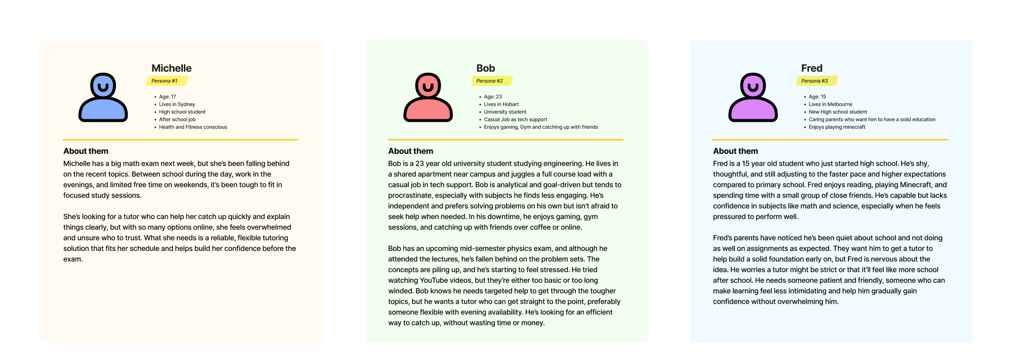
Users
The design focused on students at different stages of education, from high school to university, who need flexible, targeted academic support.
Common needs across users:
- Quickly finding relevant tutors without feeling overwhelmed
- Booking sessions that fit around school, work, and other commitments
- Feeling confident in tutor quality before committing
- Reducing friction in the booking process
Design Goals
Based on the research, I defined three core goals for Tutorly:
- Make it easy to discover tutors based on subject, availability, and location
- Give users confidence through clear information and consistent UI patterns
- Reduce friction in the booking flow from search to confirmation
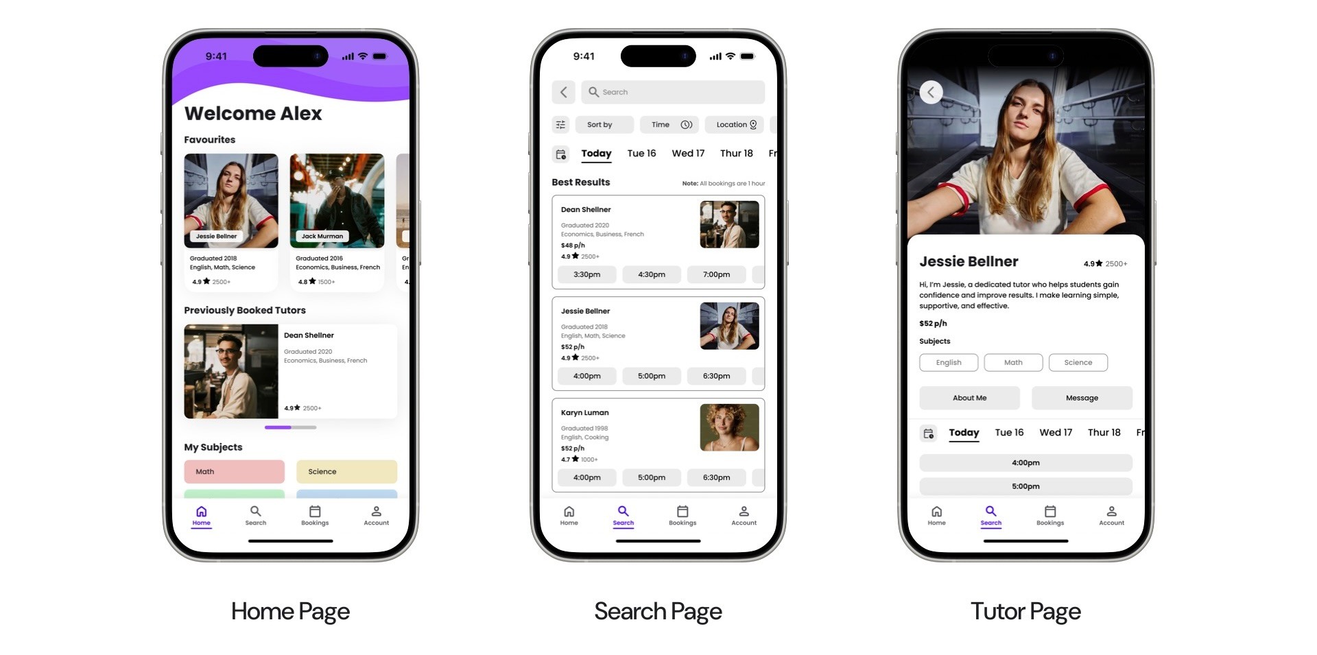
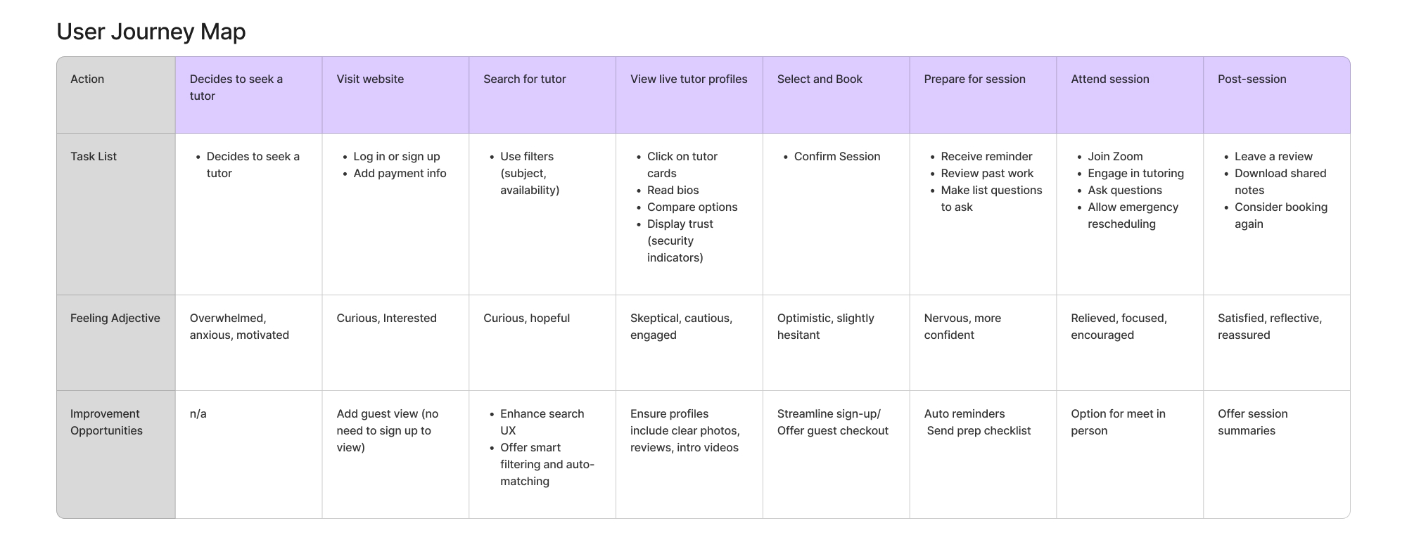
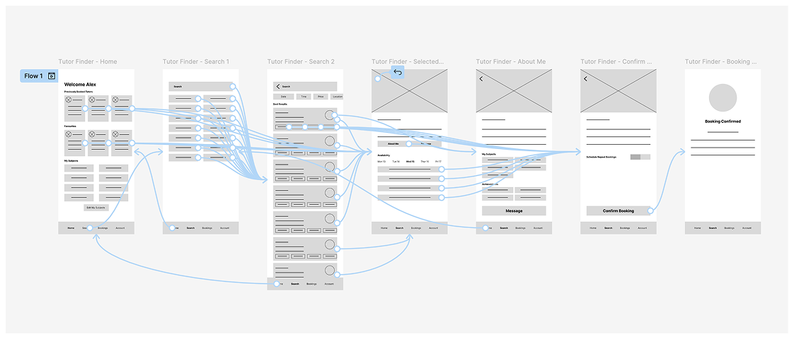
User Flow
I mapped the primary flow for booking a tutor, focusing on keeping the experience simple and predictable.
Core flow:
Home → Search → Search Results → Tutor Profile → Booking → Confirmation
Persistent bottom navigation allows users to move between Home, Search, Bookings, and Account at any time.
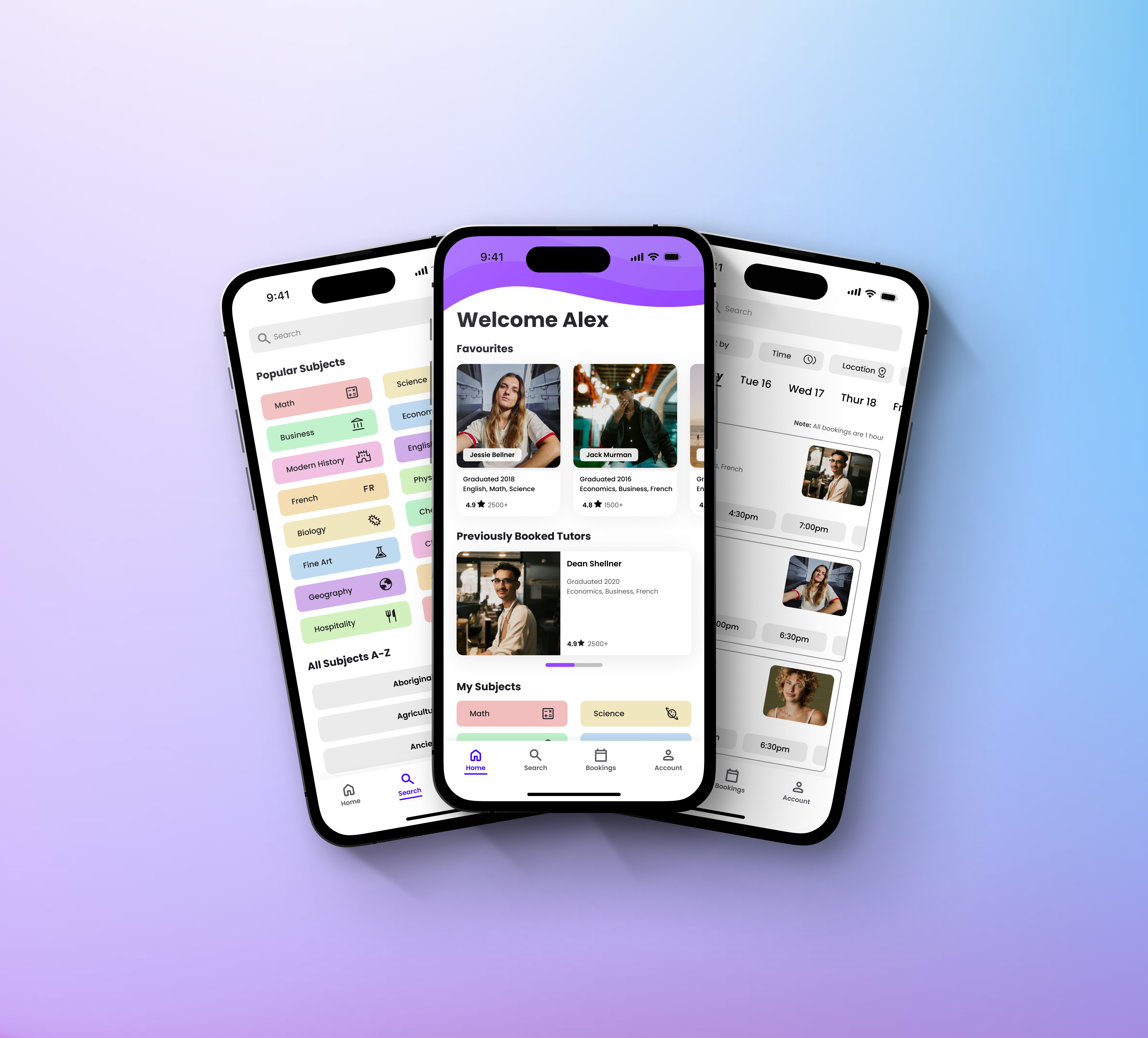
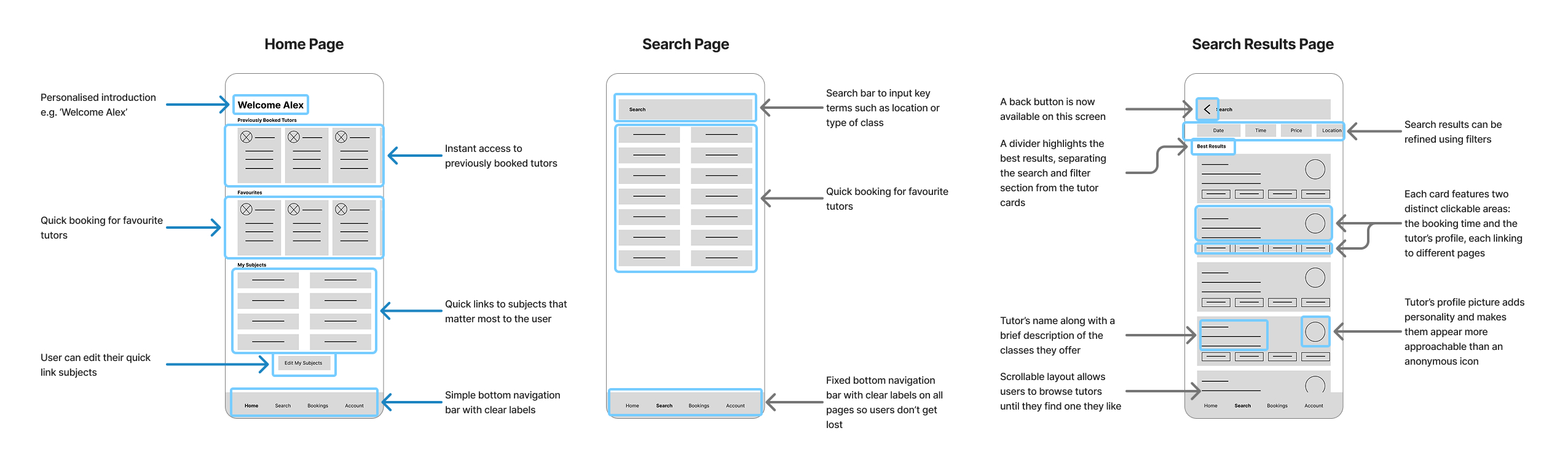
Wireframes & Early Testing
Low-fidelity wireframes were created to test structure and flow before moving into visual design.
Key findings from early testing:
- Users were unsure what to do after booking confirmation
- The booking date was unclear on the search results page
- Repetitive card layouts made the home screen feel monotonous
These findings informed changes before moving into high-fidelity design.
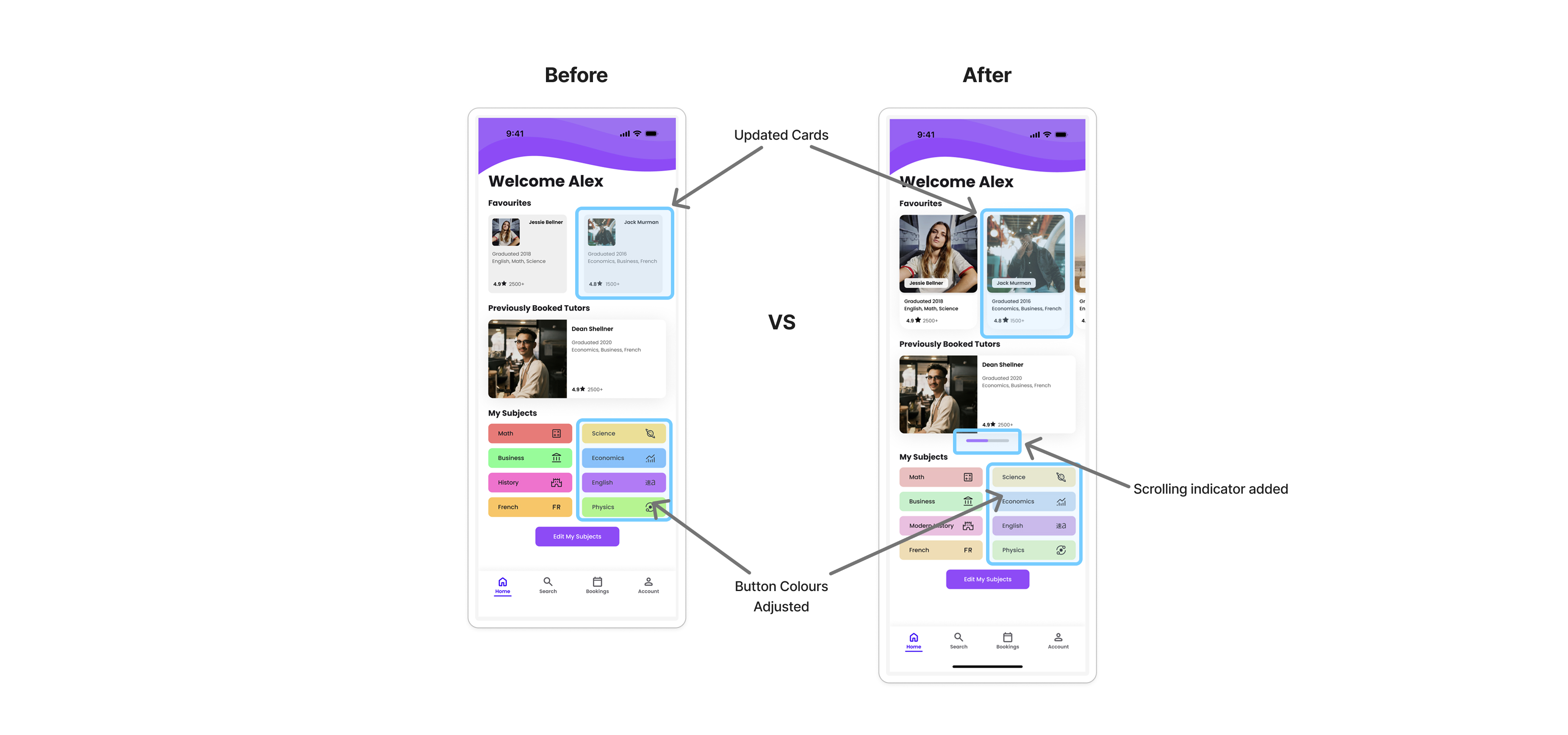
Visual Design & Iteration
High-fidelity designs focused on improving clarity, hierarchy, and accessibility.
Improvements made:
- Simplified card layouts to reduce cognitive load
- Clearer visual hierarchy to guide attention to key actions
- Softer colour palette to improve readability and accessibility
- Indicators for horizontal scrolling to make interactions more discoverable
Each iteration was shaped by usability feedback and self-review, reinforcing the importance of small, deliberate refinements.
Accessibility Considerations
Accessibility was considered throughout the design process.
- Text contrast meets WCAG 2.2 standards, with most elements achieving AAA compliance
- Clear heading hierarchy improves readability and scanability
- Consistent layouts and restrained colour use reduce visual fatigue
Outcome
The final design presents a clear, approachable tutoring platform that balances flexibility with structure. Users can quickly find tutors that suit their needs, understand what to expect, and complete bookings with confidence.
While this was a concept project, it helped solidify my understanding of user flows, hierarchy, accessibility, and iterative design.
Reflections & Learnings
This project reinforced several key lessons:
- Usability issues often surface through testing, even when designs feel clear initially
- Strong visual hierarchy plays a major role in reducing cognitive load
- Iteration is about refinement, not reinvention
This project highlighted the value of validating assumptions early and often.
Tutorly
Project Overview
Tutorly is a concept mobile app and responsive website designed to help students and parents discover, compare, and book tutors based on subject, availability, and location. At the same time, it gives tutors a central place to list their services and manage bookings.
This project was completed as part of the Google UX Design Professional Certificate, using provided research prompts and sample user data.
My role: UX Designer
Scope: Research, flows, wireframes, usability testing, high-fidelity design
Platform: Mobile app and responsive web
Problem
Students often struggle to identify and book a tutor that meets their needs.
Students and parents struggle to identify tutors who are reliable, qualified, and available at the right time or location. Many platforms require paid subscriptions, limit in-person options, or assign tutors automatically, making it hard to build continuity with someone you trust.
On the other side, independent tutors lack a centralised way to promote their services and manage availability and bookings.
Research & Key Insights
User research for this project was based on personas. Analysing these profiles helped surface consistent needs and frustrations across different student types.
Key pain points:
- Limited access and mandatory subscriptions on existing platforms
- Lack of choice and continuity when tutors are assigned automatically
- Difficulty verifying tutor quality when booking independently
- No centralised system for tutors to manage bookings
- In-person tutoring is hard to discover and often relies on word of mouth
These insights highlighted the need for a platform that prioritises choice, clarity, and flexibility for both students and tutors.
Users
The design focused on students at different stages of education, from high school to university, who need flexible, targeted academic support.
Common needs across users:
- Quickly finding relevant tutors without feeling overwhelmed
- Booking sessions that fit around school, work, and other commitments
- Feeling confident in tutor quality before committing
- Reducing friction in the booking process
Design Goals
Based on the research, I defined three core goals for Tutorly:
- Make it easy to discover tutors based on subject, availability, and location
- Give users confidence through clear information and consistent UI patterns
- Reduce friction in the booking flow from search to confirmation
User Flow
I mapped the primary flow for booking a tutor, focusing on keeping the experience simple and predictable.
Core flow:
Home → Search → Search Results → Tutor Profile → Booking → Confirmation
Persistent bottom navigation allows users to move between Home, Search, Bookings, and Account at any time.
Wireframes & Early Testing
Low-fidelity wireframes were created to test structure and flow before moving into visual design.
Key findings from early testing:
- Users were unsure what to do after booking confirmation
- The booking date was unclear on the search results page
- Repetitive card layouts made the home screen feel monotonous
These findings informed changes before moving into high-fidelity design.
Visual Design & Iteration
High-fidelity designs focused on improving clarity, hierarchy, and accessibility.
Improvements made:
- Simplified card layouts to reduce cognitive load
- Clearer visual hierarchy to guide attention to key actions
- Softer colour palette to improve readability and accessibility
- Indicators for horizontal scrolling to make interactions more discoverable
Each iteration was shaped by usability feedback and self-review, reinforcing the importance of small, deliberate refinements.
Accessibility Considerations
Accessibility was considered throughout the design process.
- Text contrast meets WCAG 2.2 standards, with most elements achieving AAA compliance
- Clear heading hierarchy improves readability and scanability
- Consistent layouts and restrained colour use reduce visual fatigue
Outcome
The final design presents a clear, approachable tutoring platform that balances flexibility with structure. Users can quickly find tutors that suit their needs, understand what to expect, and complete bookings with confidence.
While this was a concept project, it helped solidify my understanding of user flows, hierarchy, accessibility, and iterative design.
Reflections & Learnings
This project reinforced several key lessons:
- Usability issues often surface through testing, even when designs feel clear initially
- Strong visual hierarchy plays a major role in reducing cognitive load
- Iteration is about refinement, not reinvention
This project highlighted the value of validating assumptions early and often.